Published local-business transformation
A one-screen store page became a mobile site for food, fuel, and visits.
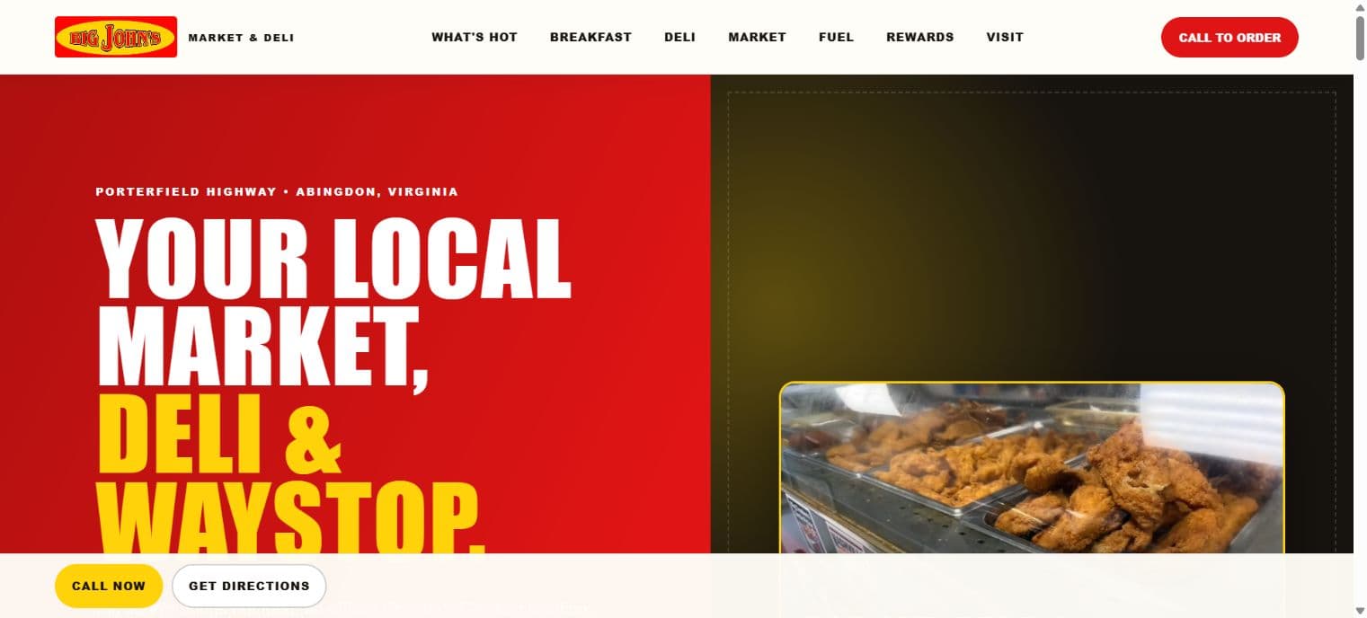
Big John’s evolved from a single-screen information page into a complete mobile-first website that helps customers discover hot food, breakfast, deli ordering, market essentials, fuel, rewards, hours, directions, and the fastest way to call ahead.
 Hot food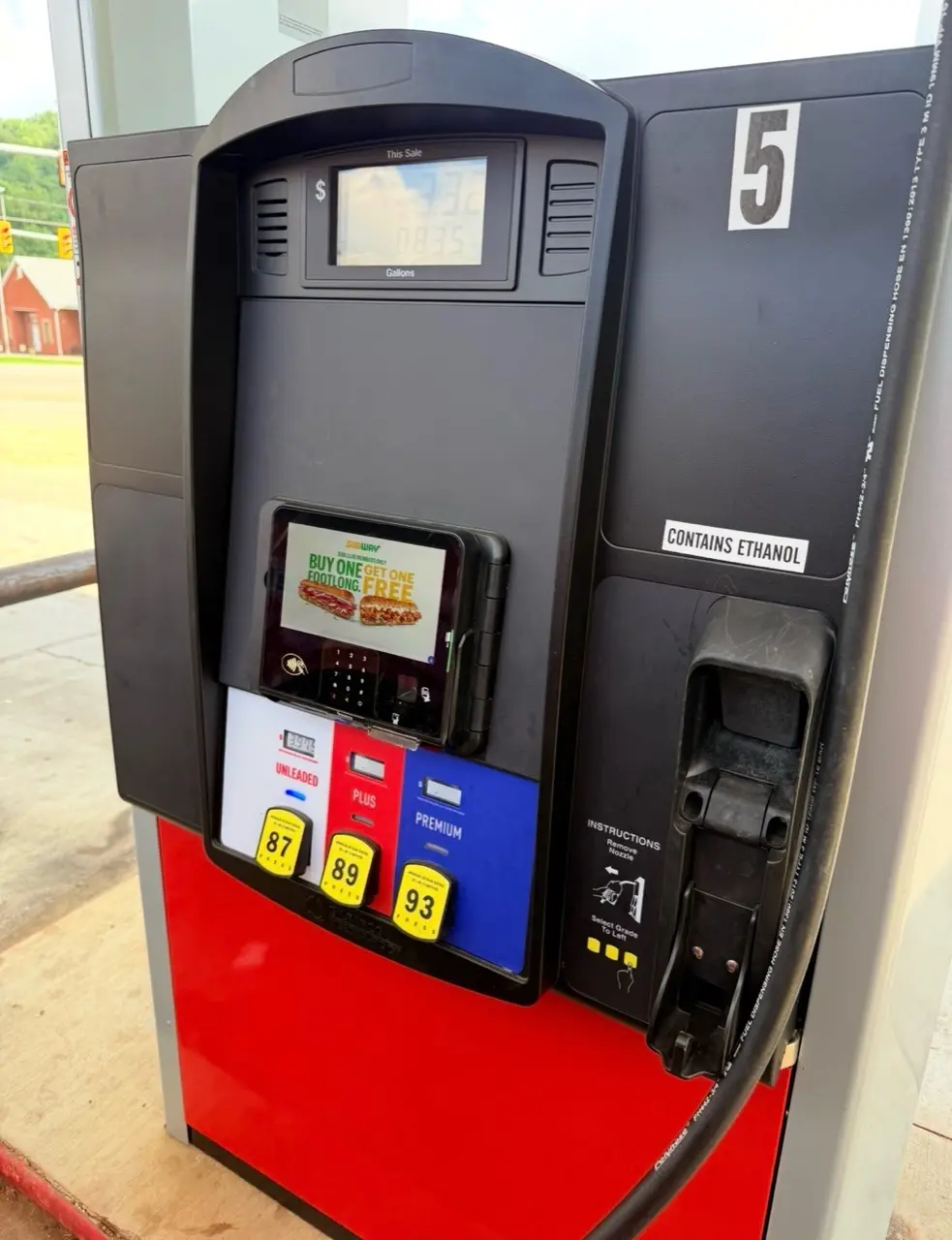
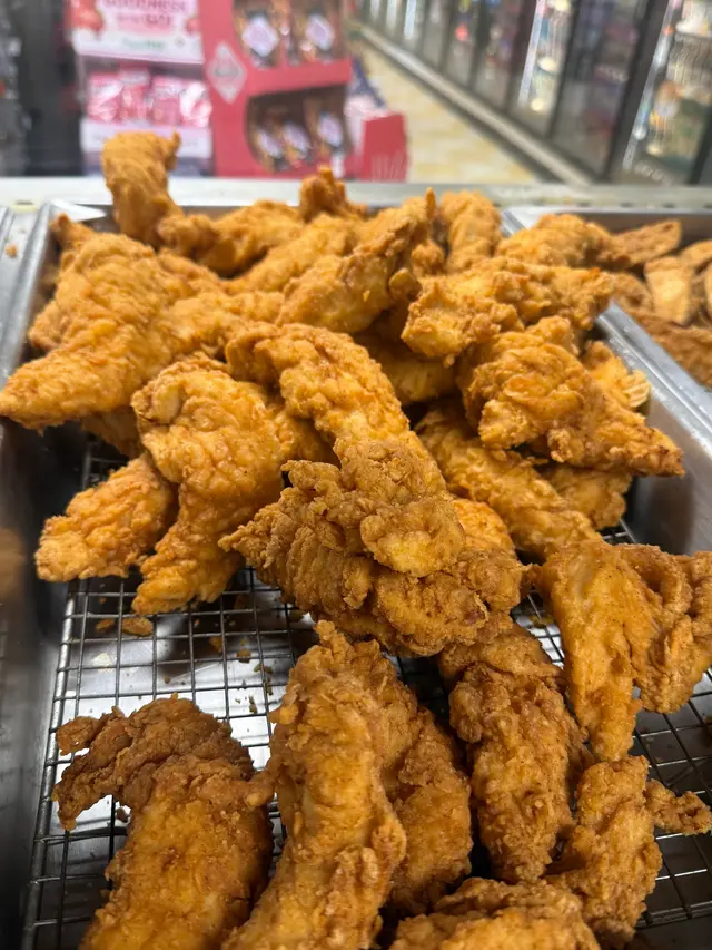
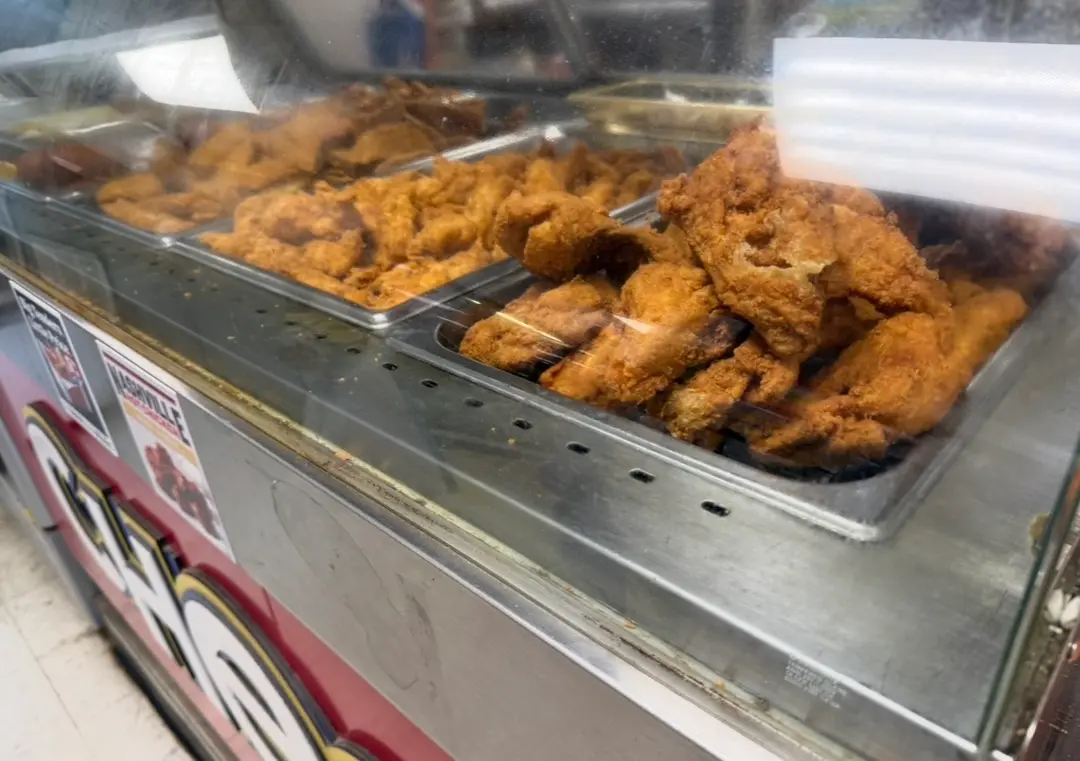
The published Big John’s website uses real food and fuel photography alongside direct ordering, directions, hours, and service links.
Relationship disclosed
Independent client website
Public evidence
Published at bigjohns.org
Outcome standard
Observable website changes—not unmeasured performance claims
Before / After
The familiar local brand now supports real customer tasks.
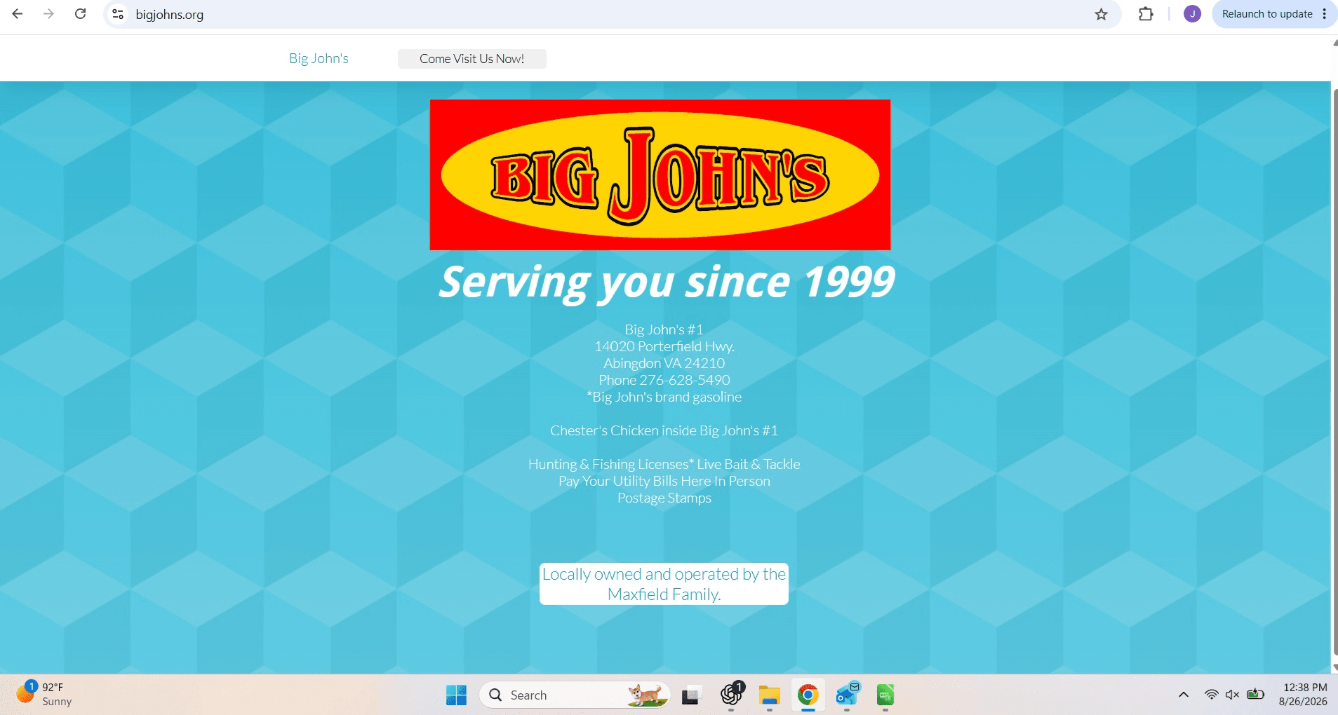
The redesign keeps the familiar red-and-yellow Big John’s identity while replacing a largely static information screen with an intentional journey. Customers can now move from appetite or need to the right detail, then call, navigate, or visit without hunting for the next step.
 Hot food
The journey
How the redesign became a more useful business asset.
01 · Preserve
Keep the brand familiar
The established logo and bold color palette remain the visual anchor, so returning customers immediately recognize the business.
02 · Organize
Create useful customer paths
Hot food, breakfast, deli, market, fuel, rewards, and visit information now have clear places in the experience.
03 · Prove
Show the real offer
Food photography, menu panels, and upgraded fuel imagery turn general claims into a more credible preview of the visit.
04 · Convert
Shorten the next step
Prominent call-to-order, phone, hours, and directions actions help mobile visitors act at the moment they are ready.
The challenge
Turn basic store information into useful reasons to visit.
The previous page shared the logo, address, phone number, and a short list of services, but it offered little context for what customers could order, when to visit, or how the market, deli, fuel, and convenience offer fit together. The new experience needed to remain unmistakably local while becoming far more useful on a phone.
The approach
Organize the site around what customers need before they arrive.
The site now leads with recognizable Big John’s branding and organizes the experience around high-intent needs: what is hot, breakfast, deli pickup, market essentials, fuel, rewards, hours, calling, and directions. Real product and store photography adds proof while persistent actions reduce the distance between interest and a visit.
Work delivered
A local retail website for food, fuel, hours, calls, and directions.
The case study records only work supported by the published project and existing project documentation.
- Customer-journey and content planning
- Responsive website design and development
- Hot-food and breakfast presentation
- Call-ahead deli ordering pathways
- Market, fuel, and rewards sections
- Real product and store photography
- Direct phone and directions actions
- Search and local-business foundations
Published result
A fuller digital storefront that makes the next visit easier.
BigJohns.org now lets visitors see real food and upgraded fuel features, check current hours, call to order, and get directions. Those actions were not available as a complete experience on the former single-screen page.
- Published at BigJohns.org
- Mobile call-ahead ordering and visit actions
- Food, fuel, rewards, hours, phone, and directions in one site
Related capabilities
Support the customer journey from local discovery through the store visit.
Build the next useful website
Turn a basic online presence into a website customers can actually use.
Start with the questions customers ask, the actions they take most often, and the parts of the business a minimal page cannot fully explain.